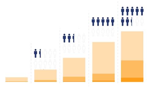
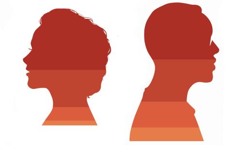
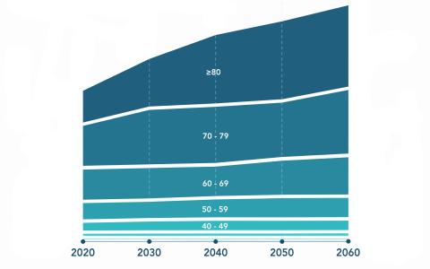
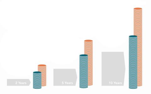
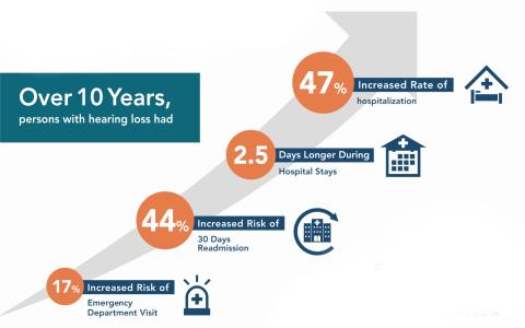
Good data visualization offers a fresh way to look at research findings. These infographics illustrate stories of hearing loss in the U.S. - its widespread prevalence and its measurable impact on healthcare costs and utilization - based on research by Cochlear Center faculty.
These infographics were created in partnership with MICA Social Design. Download and reprint of these images is permitted with proper citation and including this phrasing: Courtesy of Johns Hopkins Cochlear Center for Hearing and Public Health.